BELMONT HOMECOMING 2024 CAMPAIGN
Campaign Identity + Branding
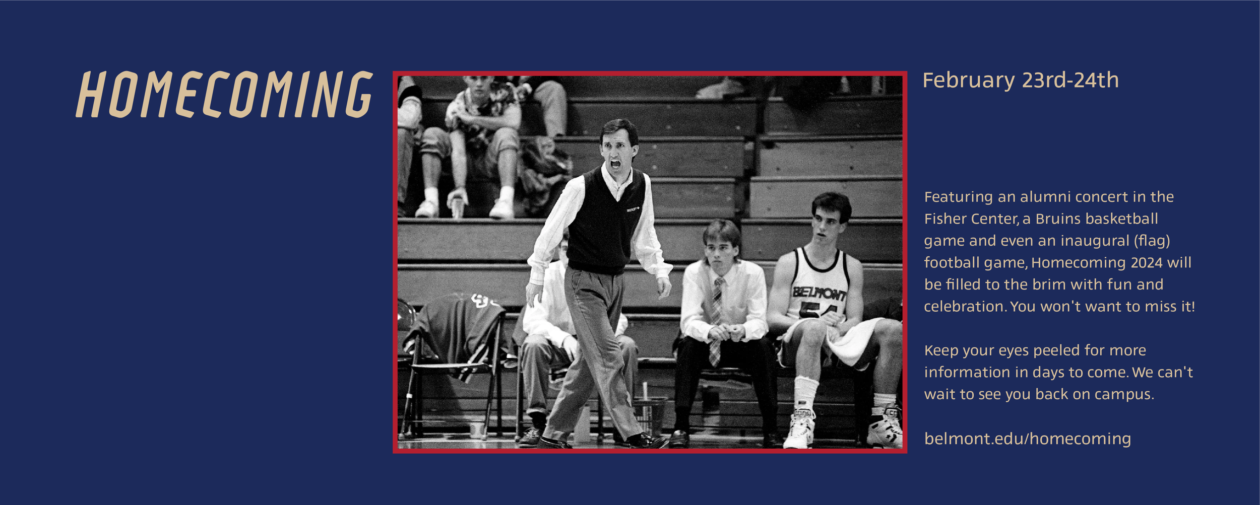
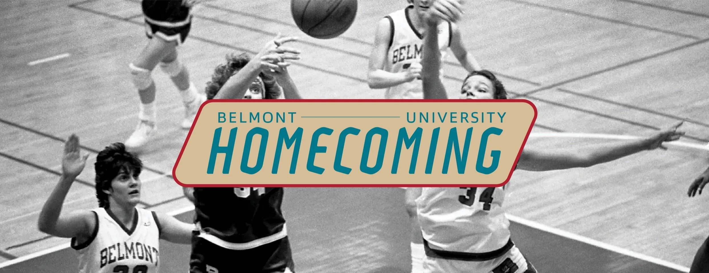
Belmont University’s 2024 Homecoming team asked me to craft a welcoming and relatable campaign, distinct from their formal branding, inviting everyone in for this year’s events.
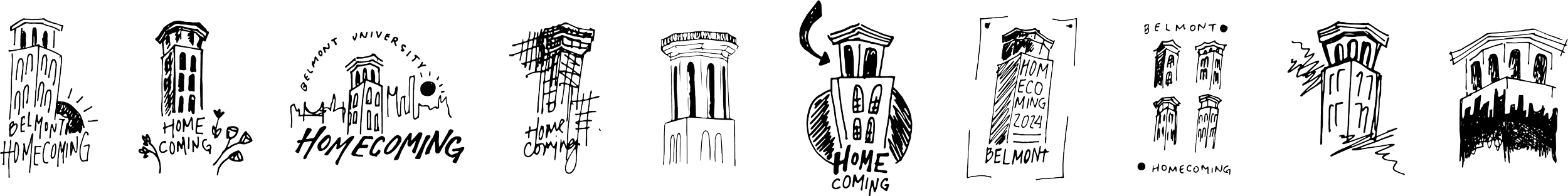
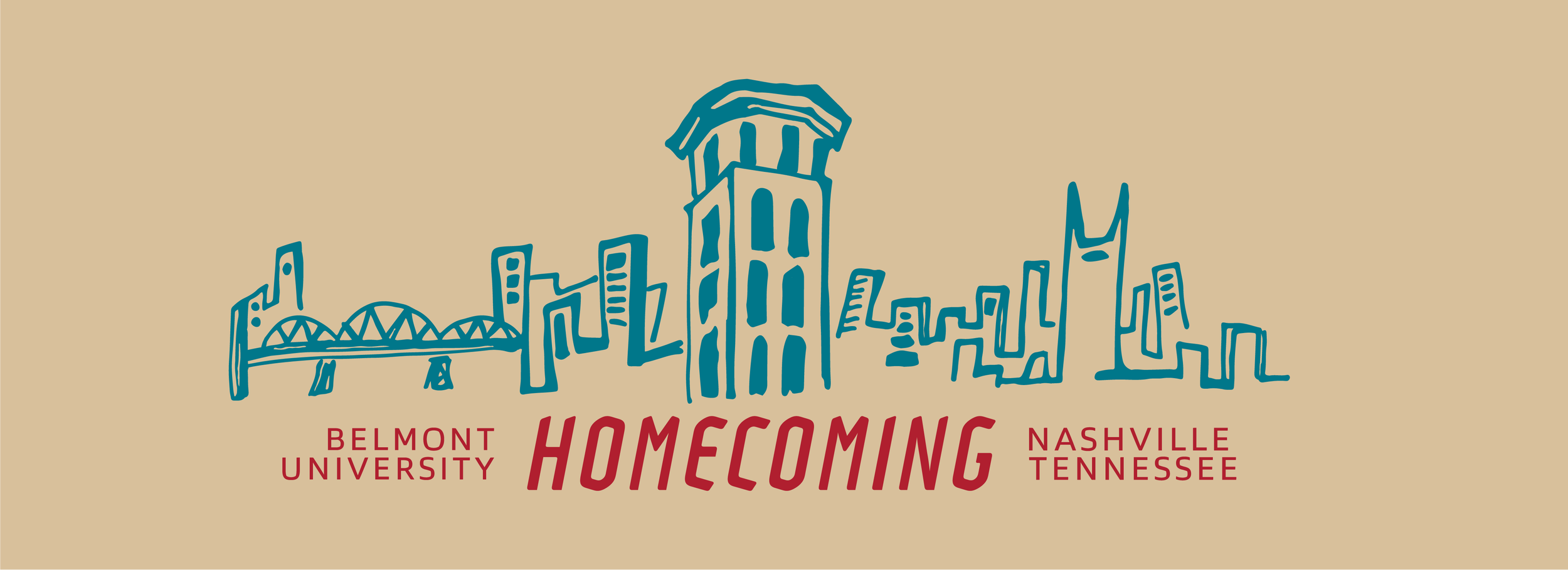
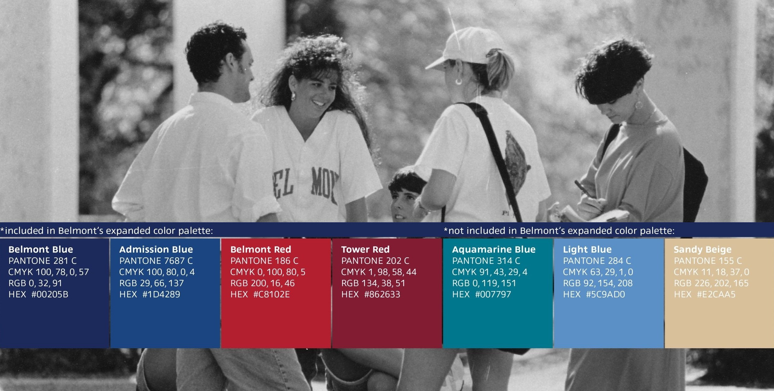
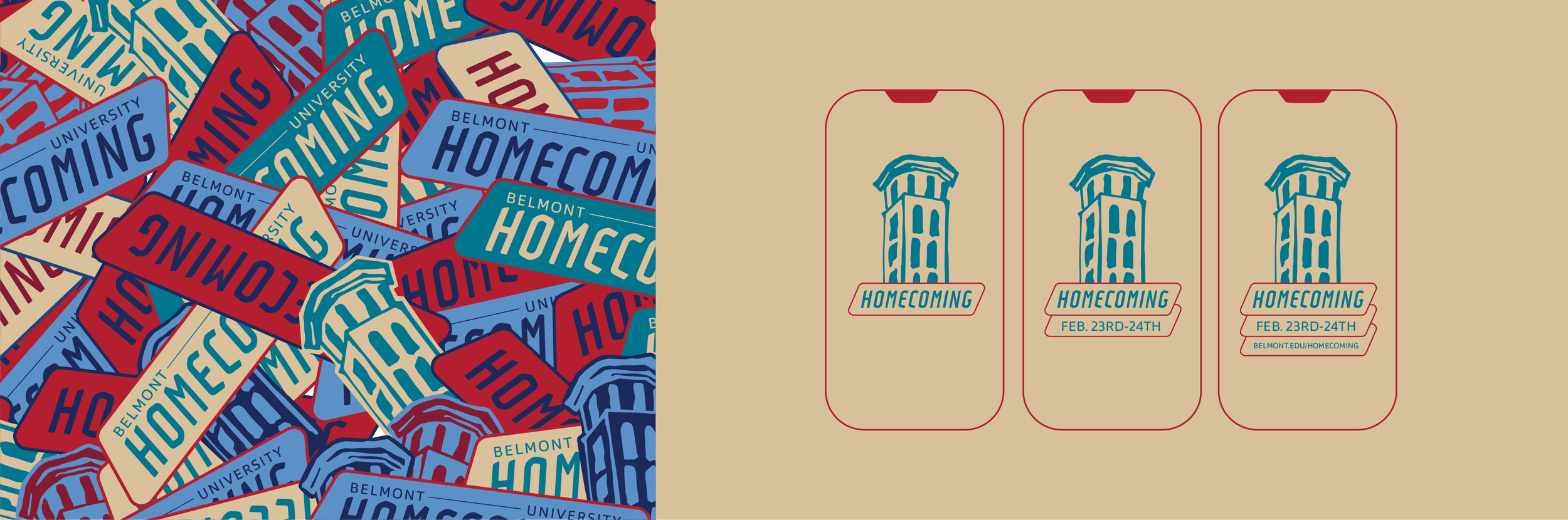
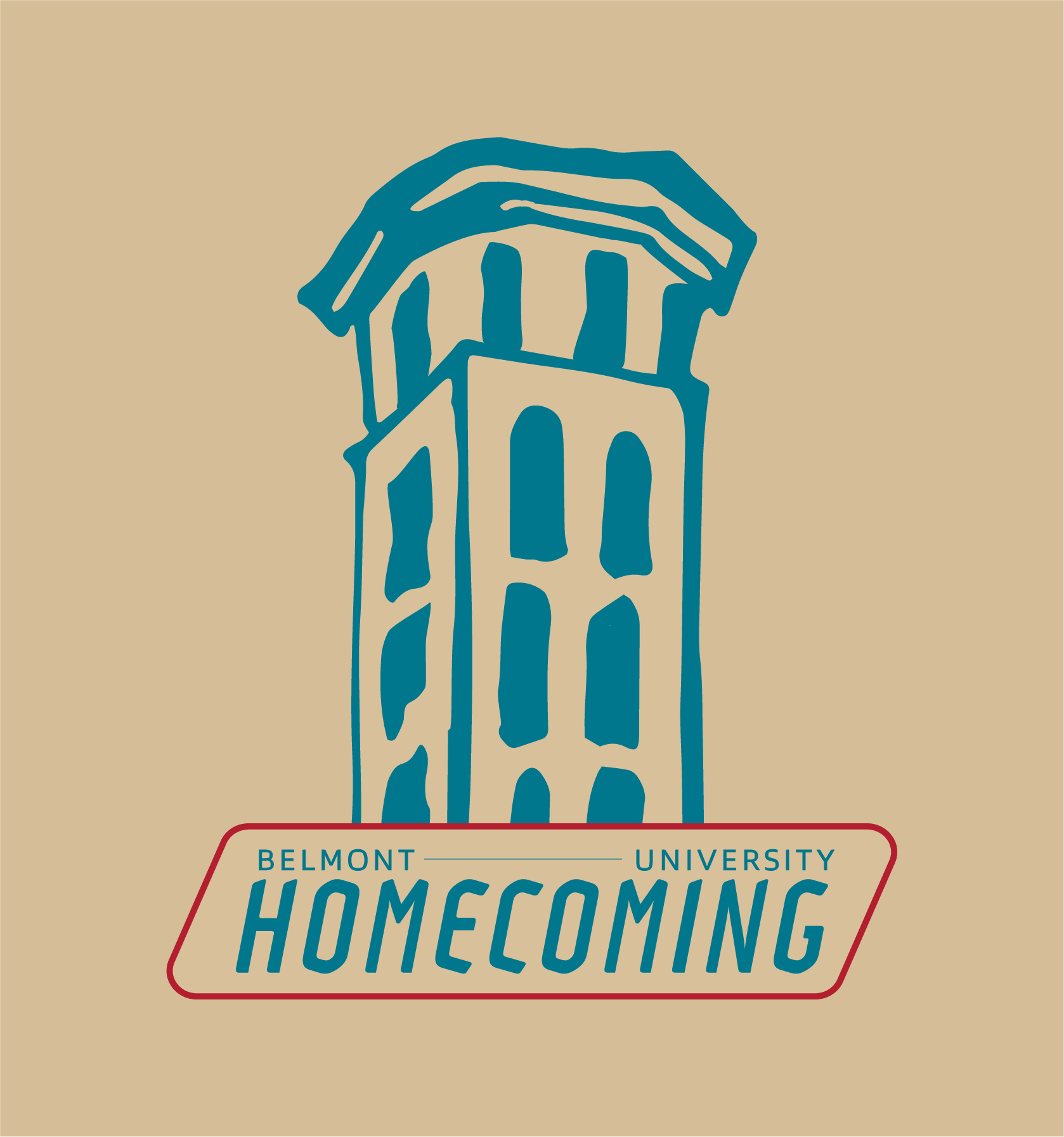
The primary mark uses the font Adso in italics-- unique, bold, and energizing. It’s paired with the clean sans-serif Prosaic Std. Both have distinctive details while remaining easy to read. I designed the bell tower, a staple Belmont symbol, to look organic and casually hand drawn. The color palette, rooted in Belmont’s brand, includes warm variations to help cultivate approachability and friendliness. To connect with older alumni, the logo is often overlapped with vintage campus photos, creating a nostalgic and scrapbook-like feel. Each design decision points to the campaign’s neighborly and easy-going energy, inviting a broad audience to join the festivities.